Laura@Pearlofthesea.org
Sign-up

Onboarding Process
Why designing a good experience for the onboarding process is important to the end-user.
Things to remember when designing
Keywords
Reduce Frustration with Password
One-Click Login
- Recognition
- Trustworthy
- Secure process
- Simple and Easy
One-Click Login
Reduce Frustration with Password
One-Click Login
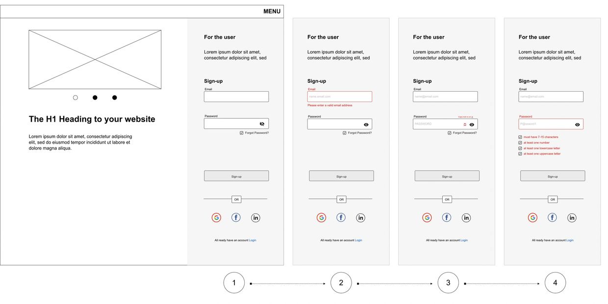
- Using existing social media accounts to sign-up for a new application provides the user with a quick and efficient process to get registered, it also eliminates the process of setting a new password and remembering it each time when they come back to use the application.
Reduce Frustration with Password
Reduce Frustration with Password
Reduce Frustration with Password
- Provide a Show Password option within the Password field (eye icon). The users can click the option, see the password they are entering, and hence make instant corrections if required.
- Use an indicator for the caps locks option is on or off.
Provide Instant Input Validation
Allow Switching between Login and Sign-up
Reduce Frustration with Password
- Instant validation helps them easily relate the feedback with the input they have just provided and they can correct it in no time.
- Display the message only when the user just left the input field.
Show Password Requirements
Allow Switching between Login and Sign-up
Allow Switching between Login and Sign-up
- Display the requirements near the password control so that users can clearly see them while entering the password.
Allow Switching between Login and Sign-up
Allow Switching between Login and Sign-up
Allow Switching between Login and Sign-up
- Both new and existing users will come to your site, so there should always be a chance to switch between the two.
Copyright © 2022 Laura Davidson - All Rights Reserved.